Why Grey Circular Buttons Are the Secret Weapon of Modern Web Design
In the vast and ever-evolving landscape of web design, trends come and go with dizzying speed. One day, neon gradients are king; the next, brutalist typography takes center stage. Yet, amidst this chaos of aesthetic shifts, one element remains a steadfast pillar of user interface (UI) design: the circular button. Specifically, the grey circular button has carved out a unique niche for itself, becoming a go-to choice for designers who value subtlety, functionality, and timeless elegance. But why exactly do these simple shapes hold so much power? And how can you leverage them in your own projects to create better user experiences?
To truly understand the significance of grey circular buttons, we must first strip away the complex layers of modern web development and look at the fundamentals of human-computer interaction. At its core, a button is an invitation. It tells the user, "Click me," "Tap me," or "Interact with me." The shape and color of that button dictate how the user perceives that invitation. A red square might scream "Stop" or "Delete," while a bright green rectangle often shouts "Go" or "Submit." The grey circle, however, whispers. It suggests neutrality, balance, and a lack of urgency that can be incredibly soothing in a digital world full of noise.
The Psychology of Shape and Color
Let's dive deeper into the psychology behind this design choice. Circles are inherently friendly. Unlike squares or triangles, which have sharp corners that can subconsciously signal danger or rigidity, circles represent unity, protection, and infinity. They have no beginning and no end. When you place a call-to-action (CTA) inside a circle, you are softening the blow of the command. It feels less like an order and more like a suggestion.
Now, consider the color grey. In color theory, grey is the ultimate neutral. It is neither warm nor cold, neither aggressive nor passive. This makes it the perfect canvas for content. When you use a grey circular button, you are ensuring that the focus remains on the icon or text inside the button, rather than the button itself. This is crucial in modern minimalist design, where the goal is to reduce cognitive load. You don't want the user staring at the UI; you want them focusing on the content.
Furthermore, grey offers incredible versatility. Whether your website features a dark mode theme, a pastel palette, or a high-contrast black-and-white scheme, grey fits seamlessly. It acts as a chameleon, adapting to its surroundings without clashing. This adaptability is why you see these buttons everywhere, from social media share icons to navigation menus in sophisticated corporate portfolios.
Practical Applications in Web Development
So, where exactly do these buttons shine in a real-world scenario? The applications are nearly endless. One of the most common uses is for social media links. Instead of a row of colorful, distracting logos, many designers opt for uniform grey circles containing white icons. This creates a clean footer or sidebar that looks professional and organized. When a user hovers over the button, a subtle color change (perhaps to the brand color of the specific social platform) provides immediate feedback without overwhelming the initial view.
Another excellent use case is in navigation menus for mobile applications. Think of the "floating action button" (FAB) popularized by Material Design. Often, this is a circular button situated in the corner of the screen. While frequently colored, using a shade of grey for secondary actions allows the primary action to stand out while still keeping the secondary option accessible. It creates a visual hierarchy that guides the user naturally through the interface.
Consider also the realm of e-commerce. Product galleries often utilize grey circular arrows for sliding through images. Because they are grey, they recede into the background when not in use, allowing the product photography to take center stage. Only when the user intends to navigate does the button become relevant. This "quiet" design philosophy ensures that the merchandise, not the interface, sells the product.
The Technical Advantage: Vector EPS and High-Resolution Assets
For designers and developers looking to implement these elements, the quality of the source file is paramount. This is where the distinction between raster and vector graphics becomes critical. When you download a package containing grey circular buttons for web, you are often greeted with a zip file containing multiple formats. Understanding why these formats matter can save you hours of frustration later.
First, let's talk about the Vector EPS file. EPS stands for Encapsulated PostScript, and it is a vector format. What does this mean for you? It means the image is defined by mathematical paths rather than a grid of pixels. You can scale a vector button from the size of a postage stamp to the size of a billboard, and it will remain perfectly crisp. There is no pixelation, no blurriness, just sharp, clean lines. This is essential for responsive web design, where buttons need to look good on a 4K monitor as well as an old smartphone screen.
Moreover, many professional asset packs include the illustration in Vector EPS format in an older version. Why is this significant? Software compatibility is a common headache in the creative industry. If you are running an older version of Adobe Illustrator or CorelDRAW, opening a file saved in the latest 2024 format might be impossible. By providing files saved in older versions, creators ensure that everyone, regardless of their software budget or update cycle, can access and edit the assets. This inclusivity is a hallmark of thoughtful resource creation.
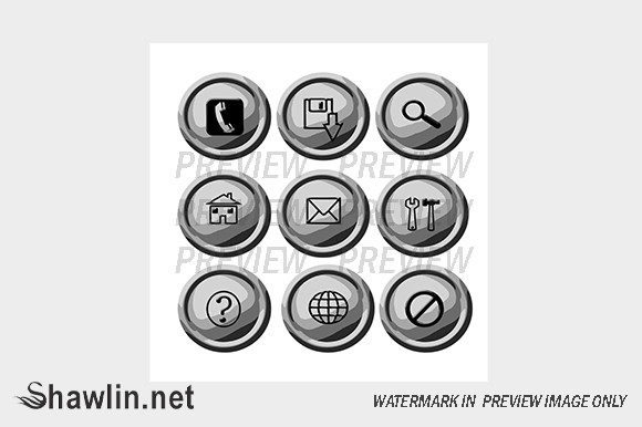
In addition to vectors, these packages typically include a high-resolution JPG format zipped together. While JPGs are raster images (made of pixels), having a high-res version is invaluable for quick mockups, presentations, or situations where vector editing isn't required. It allows project managers or clients to visualize the design immediately without needing specialized software. It is important to note a key distinction regarding watermarks: in professional previews, you will often see a watermark overlaying the image to protect the creator's intellectual property. However, once you acquire the legitimate file, there is NO WATERMARK INSIDE. The watermark exists only on the preview image to prevent unauthorized use before purchase. This ensures that your final production files are clean and ready for deployment.
Customization and Future-Proofing Your Design
One of the greatest strengths of using modular assets like grey circular buttons is the ease of customization. Because these elements are often provided in editable vector formats, you can tweak the shade of grey to match your specific brand guidelines perfectly. Perhaps your brand uses a cool, blue-toned grey, or maybe a warm, charcoal hue. With a vector file, changing the fill color takes seconds.
You can also experiment with effects. Adding a subtle drop shadow can give the button a 3D lift, making it feel tactile and clickable. Conversely, flattening the design aligns with modern "flat design" trends. The circle provides a consistent boundary within which you can experiment with hover states, active states, and focus rings for accessibility.
Accessibility is another crucial factor. When designing with grey, you must ensure there is enough contrast between the button background and the icon or text inside it. A light grey button with a white icon might look chic, but it could be invisible to users with visual impairments. Always test your grey scales against WCAG (Web Content Accessibility Guidelines) standards to ensure your beautiful design is also inclusive.
Bridging the Gap Between Creativity and Functionality
In the grand scheme of digital creativity, tools and assets are merely the building blocks. The true art lies in how you assemble them. Grey circular buttons represent a marriage of form and function. They are simple enough to be universally understood yet versatile enough to fit into almost any design language. They remind us that sometimes, the best design solution isn't the loudest or the most colorful one, but the one that serves the user with quiet efficiency.
Whether you are a seasoned web developer optimizing a checkout flow, a graphic designer crafting a brand identity, or a student learning the ropes of UI/UX, understanding the utility of these elements is vital. They are the unsung heroes of the interface, working tirelessly in the background to guide users, provide feedback, and maintain visual harmony.
If you find yourself needing a specific variation that isn't available in standard packs, remember that the design community is often open to collaboration. Many creators offer the option to contact them for custom requests using a contact form on their website. Whether you need a specific gradient, a unique icon set within the circle, or a batch of buttons in a non-standard size, reaching out can lead to tailored solutions that perfectly fit your project's needs.
In conclusion, the next time you are staring at a blank canvas in your design software, consider the power of the grey circle. It is more than just a shape; it is a tool for communication, a vessel for interaction, and a testament to the idea that simplicity often yields the most profound results. By utilizing high-quality vector assets and understanding the psychological impact of your choices, you can elevate your web projects from functional to exceptional.